 |
v2.48
|
|
|
v2.48
|
|
Represents a button capable of displaying a drop-down list of mutually exclusive actions. More...
Public Member Functions | |
| HRESULT | AddAction ([in] IAction *pAction) |
| Creates and adds a drop-down button action. | |
| HRESULT | AddSeparator () |
| Adds a separaror to the drop-down button. | |
Properties | |
| IImage | Icon [set] |
| The drop-down button icon. | |
| GUID | Id [get] |
| The identifier of the drop-down button. | |
| BSTR | IdS [get] |
| The Id of the drop-down button as a string. | |
| VARIANT_BOOL | TextVisible [get, set] |
| The action visible text on button state. | |
| BSTR | ToolTip [get, set] |
| The localized string which will be displayed for this drop-down button. | |
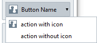
Represents a button capable of displaying a drop-down list of mutually exclusive actions.
A drop-down button displays a drop-down list of mutually exclusive actions when clicked. The icon and text are displayed on the button. It occupies two cells in the tool panel grid if the ToolTip property is an empty string, or an entire row otherwise.
The icon size is 24x24 pixels. If the provided image is bigger, it gets downscaled to fit. If no icon is provided, the space for it is still reserved.
A drop-down button object exists in Renga until the application is closed. It is possible to add the same drop-down button to multiple UI panel extensions.
| HRESULT AddAction | ( | [in] IAction * | pAction | ) |
Creates and adds a drop-down button action.
| [in] | pAction | The action to add to the drop-down button action. |
|
getset |
The action visible text on button state.
By default, the text on button is visible.
 1.16.1