 |
v2.48
|
|
|
v2.48
|
|
Represents the split button control. It is a composite control which allows user to trigger either the default action bound to the primary button, or an action out of the drop-down list of mutually exclusive actions bound to the secondary button. More...
Public Member Functions | |
| HRESULT | AddAction ([in] IAction *pAction) |
| Adds an action to the split button. | |
| HRESULT | AddSeparator () |
| Adds a separaror to the split button. | |
Properties | |
| GUID | Id [get] |
| The identifier of the split button. | |
| BSTR | IdS [get] |
| The Id of the split button as a string. | |
| VARIANT_BOOL | TextVisible [get, set] |
| The action visible text on button state. | |
Represents the split button control. It is a composite control which allows user to trigger either the default action bound to the primary button, or an action out of the drop-down list of mutually exclusive actions bound to the secondary button.
Primary button consists of an icon and a descriptive caption, both provided by the default action. The default action always appears first in the drop-down list.
A split button always occupies its own row in a tool panel grid, with both the icon and text displayed on it.
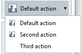
A split button exists in Renga until the application is closed. The same split button can be added to multiple UI panel extensions simultaneously.
| HRESULT AddAction | ( | [in] IAction * | pAction | ) |
Adds an action to the split button.
| [in] | pAction | The action to add to the split button. |
|
getset |
The action visible text on button state.
By default, the text on button is visible.
 1.16.1